Backblaze hard disk drive failure data: Update to Q2 2016
Ross Lazarus, September 2016
This is a Kaplan Meier analysis of the BackBlaze hard drive reliability data, using all available data to end second quarter of 2016 from https://www.backblaze.com/b2/hard-drive-test-data.html .
Previous posts are at http://bioinformare.blogspot.com.au/2016/05/survival-analysis-of-hard-disk-drive.html and http://bioinformare.blogspot.com.au/2016/02/survival-analysis-of-hard-disk-drive.html .
I reran my scripts and got the plots shown below. It's taking a while to read all the data as there are now a very large number of drives spinning. A total of 41740623 rows were processed in about 35 minutes on my home desktop by the python script in the github repository.
Updated curves:

and
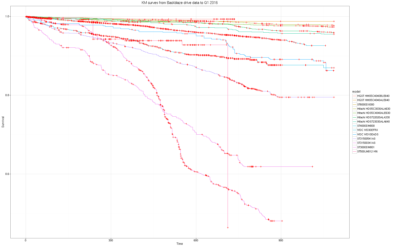
By Manufacturer:
 |
| Add caption |
Once again for me, little change is seen in the KM curves and statistics with a lot more drives and a lot more observaton time, suggesting that this statistical approach is reliable and robust, although in general we expect that more data provides better resolution.
In terms of the KM statistical tests, additional data confirms the earlier inference that there are significant differences between the manufacturer and model risk profiles over time.
Call:
survdiff(formula = sm ~ model, data = dm, rho = 0)
N Observed Expected (O-E)^2/E (O-E)^2/V
model=HGST HMS5C4040ALE640 7168 85 505.51 349.800 406.826
model=HGST HMS5C4040BLE640 8505 29 269.99 215.103 231.736
model=Hitachi HDS5C3030ALA630 4664 117 466.48 261.826 302.989
model=Hitachi HDS5C4040ALE630 2719 71 268.60 145.365 157.458
model=Hitachi HDS722020ALA330 4774 215 472.27 140.149 161.908
model=Hitachi HDS723030ALA640 1048 55 103.54 22.753 23.459
model=ST3000DM001 4707 1705 246.40 8634.322 9272.385
model=ST31500341AS 787 216 35.74 909.141 917.789
model=ST31500541AS 2188 392 157.42 349.574 363.940
model=ST4000DM000 36089 1123 1500.66 95.042 151.313
model=ST500LM012 HN 801 26 22.42 0.573 0.577
model=ST6000DX000 1915 31 77.14 27.601 28.497
model=ST8000DM002 2754 3 3.74 0.146 0.149
model=WDC WD10EADS 550 60 46.72 3.773 3.818
model=WDC WD30EFRX 1289 136 87.38 27.053 27.637
Chisq= 11353 on 14 degrees of freedom, p= 0
Call:
survdiff(formula = s ~ manufact, data = ds, rho = 0)
N Observed Expected (O-E)^2/E (O-E)^2/V
manufact=HGST 15840 120 821.8 599.348 744.193
manufact=Hitachi 13246 462 1433.5 658.440 1046.810
manufact=HN 801 26 23.6 0.242 0.243
manufact=ST 49900 3792 2255.7 1046.249 2067.849
manufact=TOSHIBA 279 12 13.6 0.181 0.182
manufact=WDC 3920 385 248.7 74.701 78.874
Chisq= 2493 on 5 degrees of freedom, p= 0


This comment has been removed by the author.
ReplyDeleteSecond attempt. Thanks for the update. I asked for this one in the original publication before looking more carefully :-) .
DeleteOne question though. Do think it was wise to draw conclusions about the 8 tb Seagates considering the lowly number of only 3 samples ?
Thanks for the comment. I assume you're referring to:
Deletemodel=ST8000DM002 2754 3 3.74 0.146 0.149
The row shows that 3 samples failed of 2754 units observed so it's not as bad as it sounds although more is usually better. All graphs are trimmed of any row with fewer than 500 observations for this reason.
What's more important is that the period to the last observation for those drives is only 6 weeks or so. KM assumes all units are under observation for the same duration so the curves are misleading here.
The perfect is the enemy of the good I guess. I've plotted the curves for periods from a few days to the maximum and they remain fairly stable after a week or so. I'll post those soon.
Could you explain what N, Observed and Expected refer to. Thanks.
ReplyDeleteOne other comment if I may, the colors are so similar it is hard to keep track. Can you consider making changes to that for future posts? Thank you.
ReplyDeleteAmen to that! A couple of ways to improve that:
Delete1- Choose a colorblind-friendly color palette. (Info on that available across the web, including here: http://bconnelly.net/2013/10/creating-colorblind-friendly-figures/).
2- Make the lines a bit thicker so the color is readily discernable on a high-resolution screen.
3- Consider using various dash patterns for the lines as well.
4- If nothing else, labeling the right side of each line with what it represents would make it much easier to see which line is what.
Thanks for your in-depth analyses!
I'm a couple of weeks off retirement and might try this out once I've time on my hands - make the lines a little thicker AND set the marker colour to the same as its line's colour.
ReplyDeleteI do find the KM displays much more informative - thanks very much for doing this.
The graph makes me see more things. Many people can do this graph. But for me, I have to hire someone to make me. gclub
ReplyDeleteResultangka88
ReplyDeleteResultangka88
Resultangka88
Resultangka88
Resultangka88
ReplyDeleteThanks For Post which have lot of knowledge and informataion thanks.... Backblaze Crack
DiskGenius Crack